Our most recent Pre-Vis edit. Getting there now, just a few more changes to come, (along with putting in the new characters....)
Far-Fetched 3D PreVis from Daniel Ridley on Vimeo.

Wednesday, 10 February 2016

Post Frank Era - New Character Designs.....Again
New character designs!!....again.
Last Thursday we had an art direction meeting with one of our lecturers Frank Victoria. It was suggested that our entire art direction looked a bit...studenty. After crying for a few hours we decided to overhaul the designs of both characters. We freelanced out the robot designs to a very talented student here, Veronika Epstiena who came up with these Tim Burton-esque designs:

We've decided to proceed with modelling the first character design which should be finished by Friday.
The dog has also been redesigned too. We were having some issues posing the dog in an appealing way. The model itself only seemed to look good in the one pose that he was modelled in. As a result we went back to some earlier designs and chose a more appealing dog.
The old test sculpts from the summer:


We gave these designs over to our freelance artist Bear Winter-Perreau who sculpted our new dog below!!


The rigging for this new guy should be finished by this Friday also.
These redesigns have put our film behind schedule a little bit but we're hopeful our film will be better for it. Unfortunately this has meant that animation progress has been put on hold until this Saturday, but nothing a few early mornings and late nights won'[t fix to put us back on schedule!
Tuesday, 2 February 2016
Animation is officially underway!!!
Big day for the Far-Fetched team. Animation work has begun!!

Some animation and posing notes for one of the shots in the film

Some animation and posing notes for one of the shots in the film
Friday, 29 January 2016
New Tablet Screens
Since we changed the design of the tablet/camera it made more sense to change the screen designs too. We wanted the screens to resemble more of a branded tourist handbook. By putting the logo of "Robot Guides" in the corner and framing the screen with the orange lines it became much clearer to read too. These designs are still pretty rough at the moment...


Thursday, 28 January 2016
Latest 3D Pre-Vis
Thought it'd be a good time to show a rough 3D pre-vis version of our film! As it stands this version is already about 1 week old but we're happy so far with the editing and pacing:
FarFetched - 3D PreVis, V2 from Daniel Ridley on Vimeo.
We have been in contact with several composers so far to help us score our film. The soundtrack will be mostly electronic in the style of some older Looney Tunes cartoons. Some inspiration we hope to draw upon are Daft Punk and their songs "Face To Face" and "Short Circuit"
FarFetched - 3D PreVis, V2 from Daniel Ridley on Vimeo.
Wednesday, 27 January 2016
Tablet Design Update
We felt like the old tablet design was a bit too boring and uninteresting to look at. Since the robot is a tourist on earth the tablet must also have a touristy feel. We modeled the new design based on the cross between a digital camera and an old video camera:

Tuesday, 26 January 2016
Some Sticker Designs
Some sticker designs that our robot is going to have on him. The idea is that they're like suitcase stickers which he has collected from the other planets he has visited:


Wednesday, 20 January 2016
Art Direction


A quick paintover of a frame in our pre-vis by Bear Winter-Perreau our resident freelance artist:

Tuesday, 19 January 2016

Saturday, 9 January 2016
Updated Robot Design
Apologies for the lack of activity in the blog recently! Progress on the film is still chugging along. The team is currently gripped by deadlines coming up the next week. The big one being the pre-production folder for our film. We'll post the folder on Wednesday!!
In the meantime we've made further design improvements to the robot design. We moved away more from the absolute simplicity of the geometric cube by adding in some slight details within the cube. A few touches of asymmetry here and there have made a huge difference too.


Tuesday, 8 December 2015
Re-storyboarding
After spending about a week solely working on modelling and vis dev we decided to have another look at the story with fresh eyes. After watching the film again on the bigscreen we decided to try and liven the whole story up and have some more fun with it.
After writing down some important story notes we wanted to stick to we then grabbed the whiteboard markers and began storyboarding out the whole story again:


Thumbnailing out random ideas and gags we were able to boost different parts of the story. It seems obvious but this process of scribbling drawings out in the open so we can all see them was so useful. It made it obvious which parts dragged the pacing or which parts wouldn't cut together very well. This isn't to say we weren't drawing out the story before but having it on display like this and being able to change parts around instantly was very helpful and refreshing.
This draft of the story has ended up being our 10th draft of the film...STORY IS HARD
But by now we can see why big animation companies spend such a long time on story. Not only is it super hard to do but also everything hangs off the story so it requires an awful lot of time and effort. Hopefully we've made some progess....
Thursday, 3 December 2015
New Robot Design
New robot design:

We decided to give the robot a square design in order to contrast the curvy dog and curvy environment. That way the robot really stands out and is seen as something that is not from this world. We'll be adding fridge magnets onto his body too, each one representing a planet from the solar system he's visited. Hopefully this will make him seem more like a tourist.

We decided to give the robot a square design in order to contrast the curvy dog and curvy environment. That way the robot really stands out and is seen as something that is not from this world. We'll be adding fridge magnets onto his body too, each one representing a planet from the solar system he's visited. Hopefully this will make him seem more like a tourist.
Monday, 16 November 2015
Colour
During last week we all had a sit down and looked through some books on colour. We did this to try and figure out what colour style we want our film to have. One of the best books we looked at was Maurice Noble's book "The Noble Approach" It refreshed our minds as we looked at how he builds a colour scheme for the Looney Tunes shorts.
The first aspect of colour Maurice Noble works on first is the colour scheme of the character, and then we can work on fitting the environment colour scheme around the character:


The first aspect of colour Maurice Noble works on first is the colour scheme of the character, and then we can work on fitting the environment colour scheme around the character:


From here we plonked the characters in an environment and began messing around with some more colours:


Wednesday, 11 November 2015

Tuesday, 10 November 2015
Some colour and environment tests
Since we have early models of the robot and dog we decided to do some quick colour and environment tests in Maya.


We assigned basic lambert shaders to the models and environment and then just played around with the colours. We then changed the viewport to only show flat lighting and turned on ambient occlusion. The result was actually quite pleasing. We're thinking about keeping the environment as vibrant as possible without being too busy or overwhelming.


We assigned basic lambert shaders to the models and environment and then just played around with the colours. We then changed the viewport to only show flat lighting and turned on ambient occlusion. The result was actually quite pleasing. We're thinking about keeping the environment as vibrant as possible without being too busy or overwhelming.
Thursday, 5 November 2015
Robot Design - Update
We've made some changes to the robot design based on our feedback from the lecturers. We're much happier with the design at the moment. It's proportions will definitely be easier to animate too.
I began by drawing out the silhouette so it'd be easier to concentrate on the proportions of the design. We also wanted to get the size contrast looking nice between the dog and the robot too.


He basically has longer legs than before and a slimmer body, but still keeping that slightly overweight look.


I began by drawing out the silhouette so it'd be easier to concentrate on the proportions of the design. We also wanted to get the size contrast looking nice between the dog and the robot too.

He basically has longer legs than before and a slimmer body, but still keeping that slightly overweight look.
From here I adjusted the model we had in Maya to represent the silhouette:


We also redesigned the robot's mouth so he'd be capable of more expressions. Previously the mouth would pivot open like a bin lid, which looked nice but he couldn't really hit some of the more subtle emotions. We ended up looking at the 2005 film Robots to see exactly how they managed it. Though i'm not a huge fan of the designs the way the mouths worked was pretty cool.
There's a flexible cheek around the mouth opening which enables the animators to sculpt in some nice mouth shapes:

Using this as reference we redesigned our robot's face:
Using the cheek geo we can hit some nicer graphic shapes with the mouth


The shapes of the robot need some further refining but as a base we're much happier than before!
Tuesday, 3 November 2015
Pre-Production Review and Feedback
The previous week we had a large review session with our peers and lecturers. The entire process is hugely helpful as it gets a fresh pair of eyes on our film and design concepts.
Among some of the issues pointed out are as follows:
Robot Character Design:
The early concepts where there is a greater size contrast between the dog and the robot is more appealing. It's funnier to see such a large robot be scared by such a small dog. There were also concerns about being able to get a good enough acting performance out of the robot due to it's wide body shape and the number of facial expressions he could potentially make.
Environment Concepts:
It was widely agreed that the environment would make more sense if it was set in a park or a common instead of a redwood forest. The story would make more sense for dog to appear in that type of environment instead of a redwood forest in the middle of nowhere.
The Film Edit:
Overall the film edit is working okay. There are a few things we need to keep in mind as we keep working on it. I'll cover these changes next blog post.
Among some of the issues pointed out are as follows:
Robot Character Design:
The early concepts where there is a greater size contrast between the dog and the robot is more appealing. It's funnier to see such a large robot be scared by such a small dog. There were also concerns about being able to get a good enough acting performance out of the robot due to it's wide body shape and the number of facial expressions he could potentially make.
Environment Concepts:
It was widely agreed that the environment would make more sense if it was set in a park or a common instead of a redwood forest. The story would make more sense for dog to appear in that type of environment instead of a redwood forest in the middle of nowhere.
The Film Edit:
Overall the film edit is working okay. There are a few things we need to keep in mind as we keep working on it. I'll cover these changes next blog post.
Tuesday, 27 October 2015
Pre-Vis Review
A Pre-Vis review session on the big screen:

We filmed a rough live-action cut of our film based on the storyboards. The purpose is to help us figure out the pacing and editing as well as being easy to change depending on feedback from our peers and lecturers.
Watching Pre-Vis back on a big screen really helps us spot issues they we would otherwise miss when watching it on a computer screen.

We filmed a rough live-action cut of our film based on the storyboards. The purpose is to help us figure out the pacing and editing as well as being easy to change depending on feedback from our peers and lecturers.
Watching Pre-Vis back on a big screen really helps us spot issues they we would otherwise miss when watching it on a computer screen.
Robot Design
Since our Robot is essentially a tourist from space, the design needs to reflect this story choice. The design also needs to reflect his personality traits, we're going for an American tourist (apologies to all Americans)
Up until we had decided exactly what personality traits the robot had such a wide range of designs for the robot which caused a lot of headaches. Some of the variety we had here:


Up until we had decided exactly what personality traits the robot had such a wide range of designs for the robot which caused a lot of headaches. Some of the variety we had here:


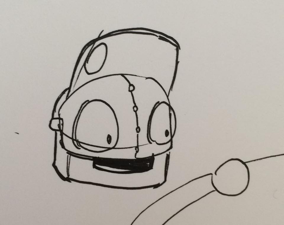


Once we knew exactly what character design we wanted we started to dial in the design. A major design change was acknowledging the fact that robot was from space and therefore not built by humans, This meant that the design could not be overly mechanical as a mechanical design implies that it was built by humans.


Hopefully the american tourist look comes across well with the addition of robot fanny packs
Subscribe to:
Posts (Atom)